Client: Arenales
Role: Brand Designer at Estudio Madre
Role: Brand Designer at Estudio Madre
About the Project:
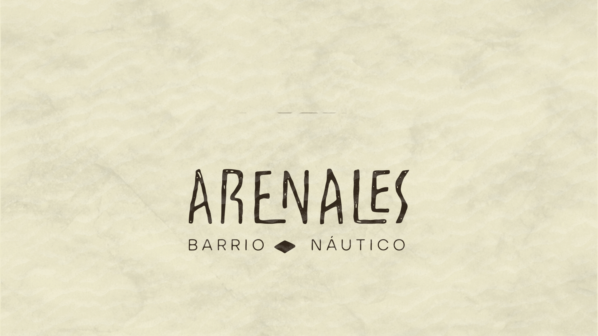
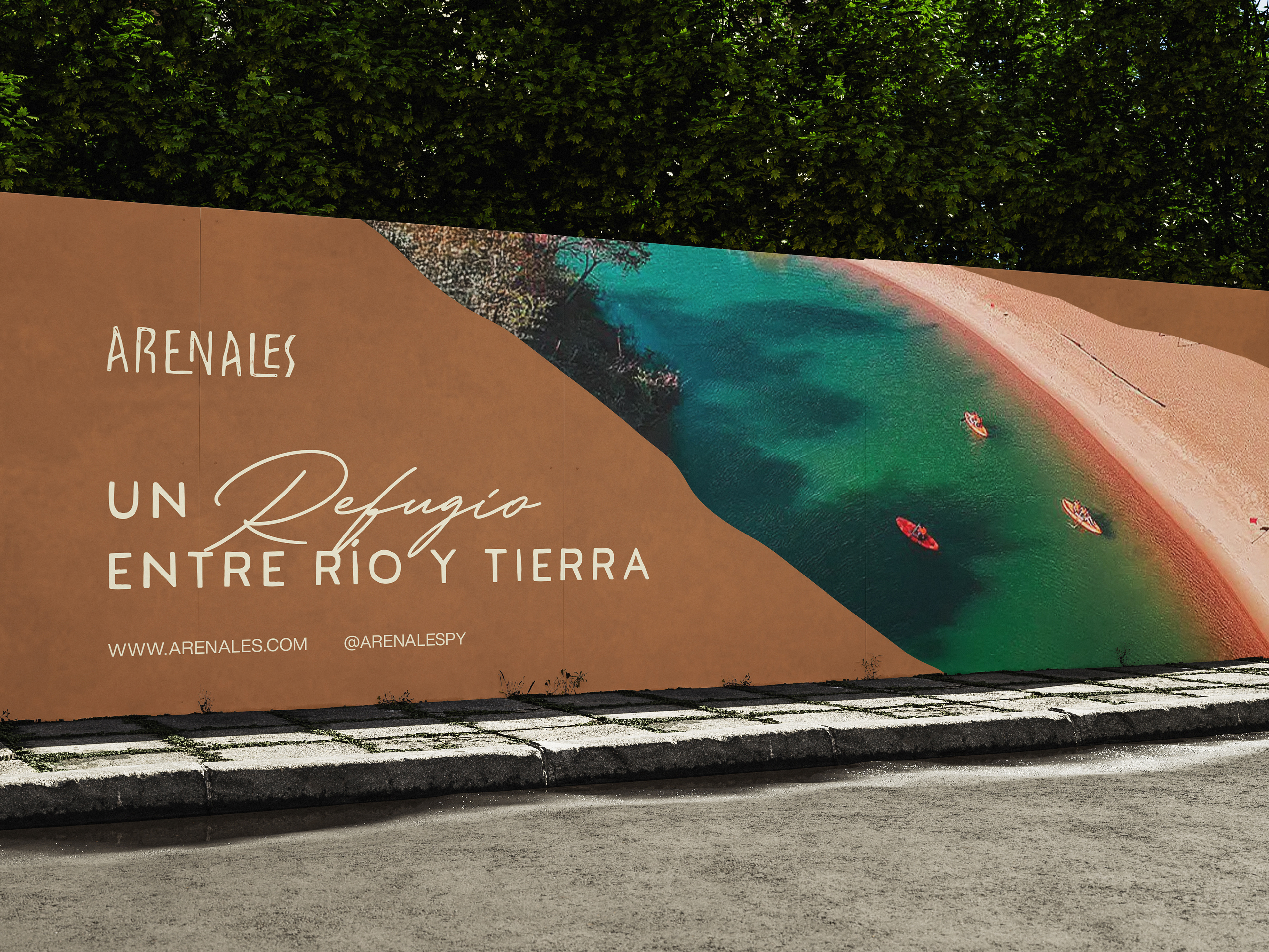
Arenales is a unique gated community located along the river, centered around a nautical lifestyle. This project aimed to reflect a warm, welcoming environment, inspired by the natural surroundings and the connection with water. The identity design needed to balance the exclusivity of the neighborhood with a sense of comfort and relaxation, appealing to potential residents seeking a serene and luxurious waterfront lifestyle.
Arenales is a unique gated community located along the river, centered around a nautical lifestyle. This project aimed to reflect a warm, welcoming environment, inspired by the natural surroundings and the connection with water. The identity design needed to balance the exclusivity of the neighborhood with a sense of comfort and relaxation, appealing to potential residents seeking a serene and luxurious waterfront lifestyle.
Our Approach:
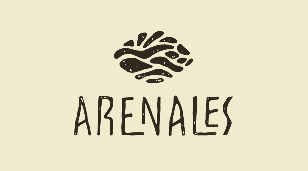
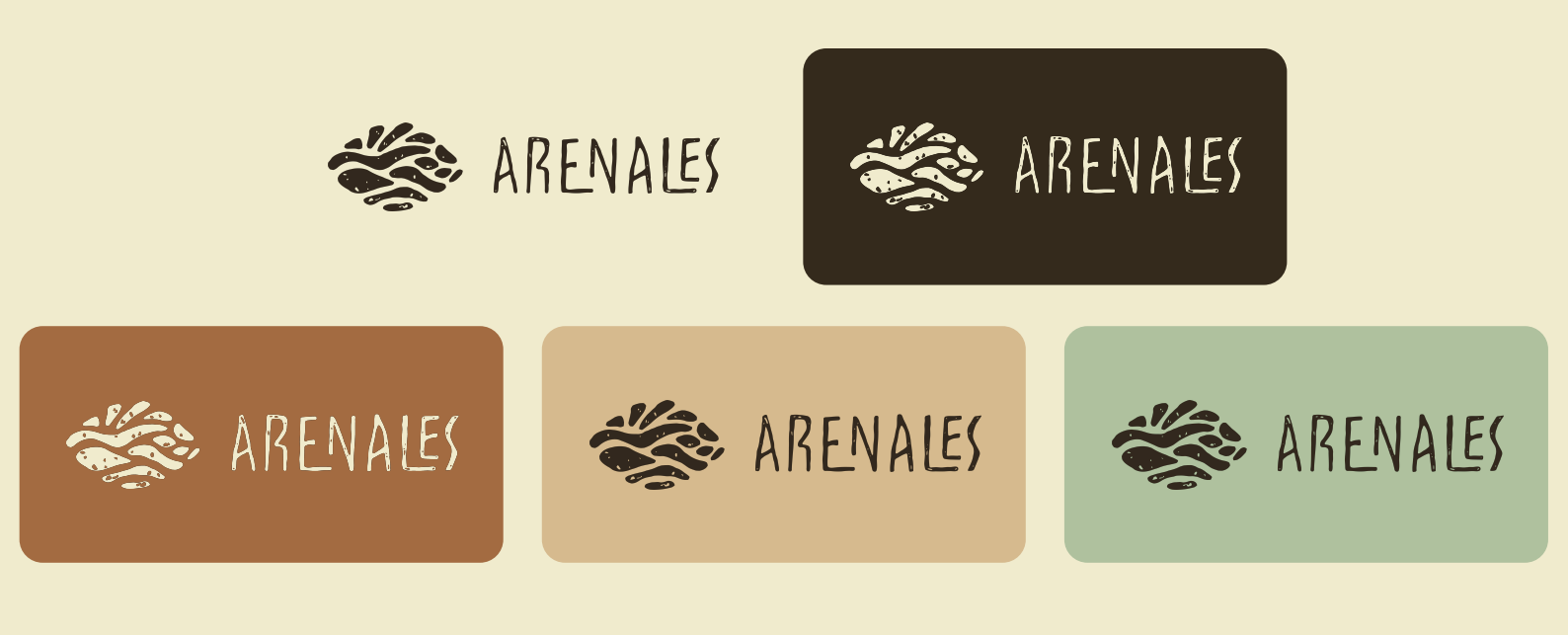
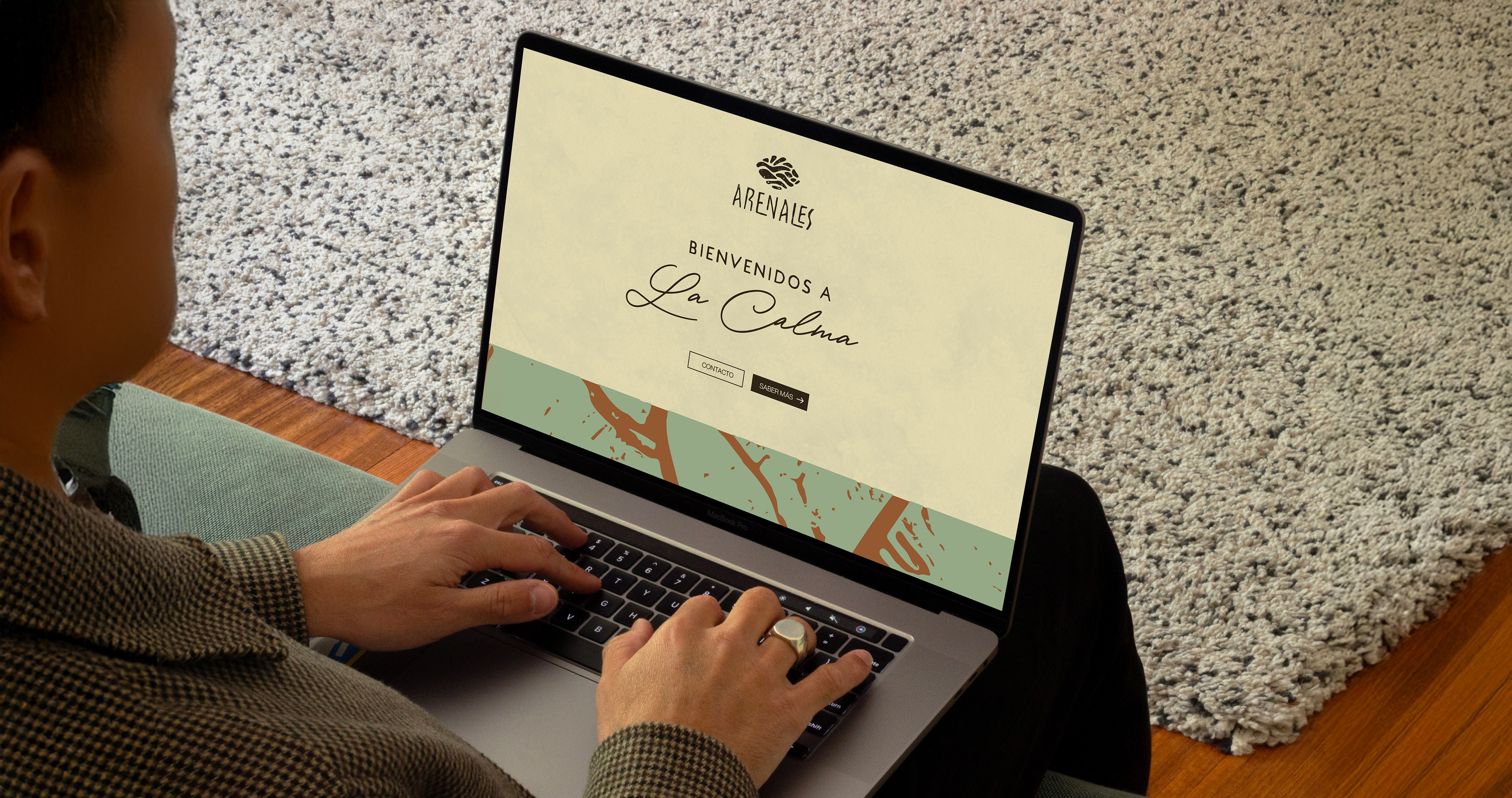
We began by designing an expressive and organic logo, incorporating an abstract representation of sand dunes and water, symbolizing the harmony between land and water. The warm color palette and the use of natural textures in the branding aimed to evoke a sense of calm and connection with nature. The addition of the isotipo (symbol) reinforced the brand’s unique identity, emphasizing its connection to both nature and the nautical lifestyle.
We began by designing an expressive and organic logo, incorporating an abstract representation of sand dunes and water, symbolizing the harmony between land and water. The warm color palette and the use of natural textures in the branding aimed to evoke a sense of calm and connection with nature. The addition of the isotipo (symbol) reinforced the brand’s unique identity, emphasizing its connection to both nature and the nautical lifestyle.
The Result:
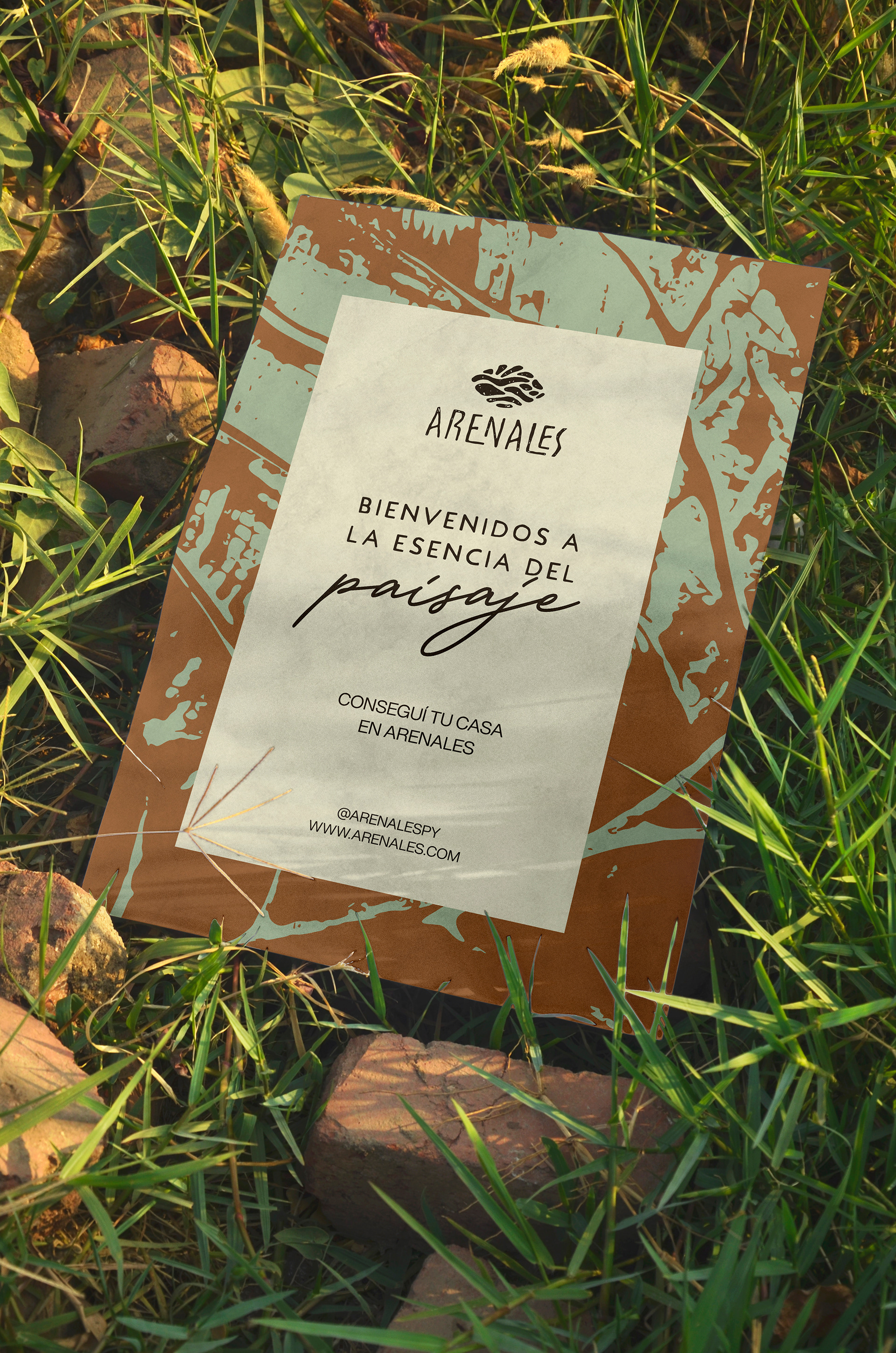
The final visual identity captures the essence of Arenales—an exclusive yet inviting place where the land meets the water. The design conveys warmth, tranquility, and a deep connection with the natural environment, while the isotipo adds a memorable and distinctive touch to the brand.
The final visual identity captures the essence of Arenales—an exclusive yet inviting place where the land meets the water. The design conveys warmth, tranquility, and a deep connection with the natural environment, while the isotipo adds a memorable and distinctive touch to the brand.